The Rubaiyat of Omar Khayyam:
1950s Peter Pauper Press Vera Bock Edition
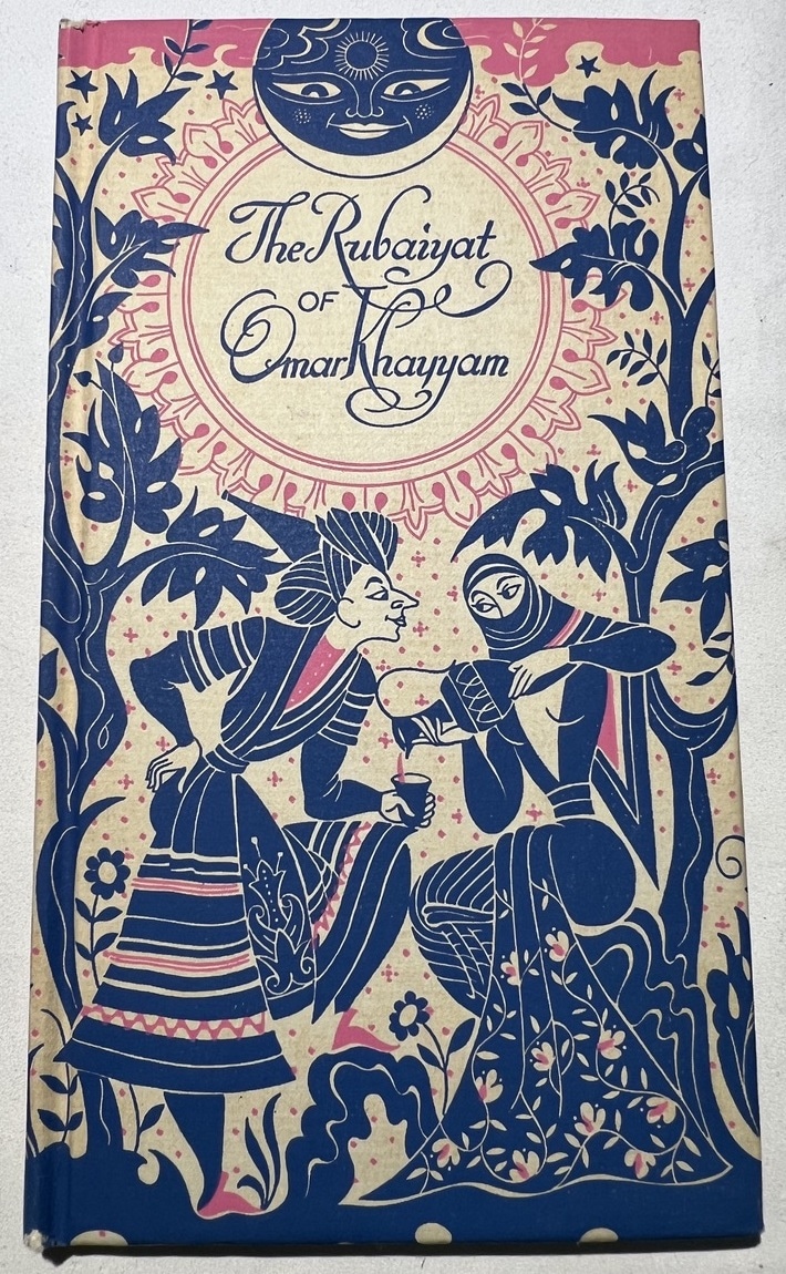
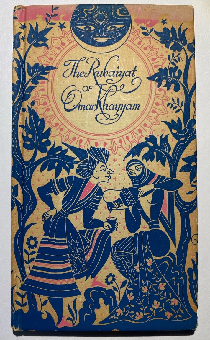
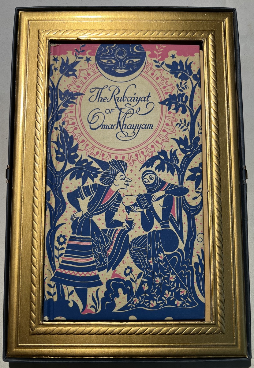
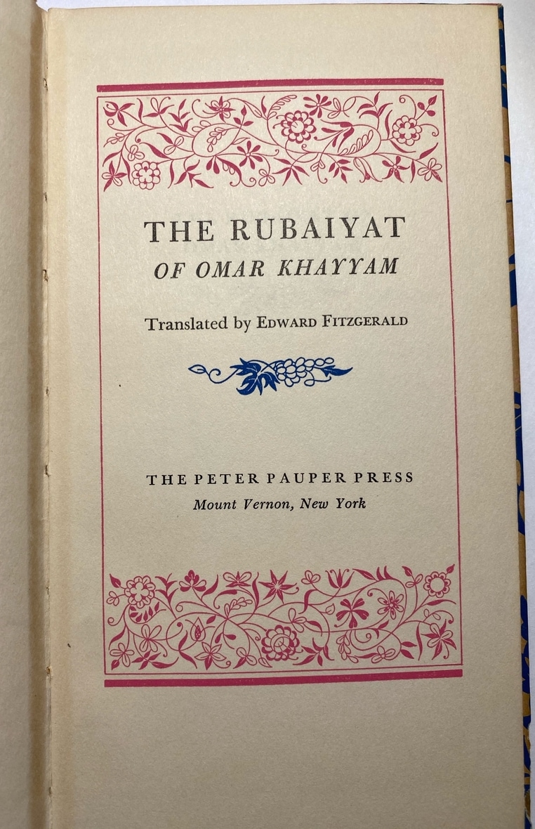
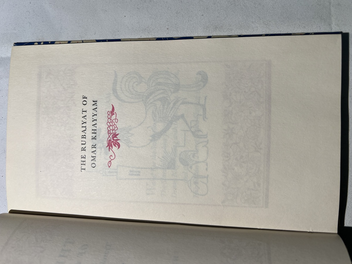
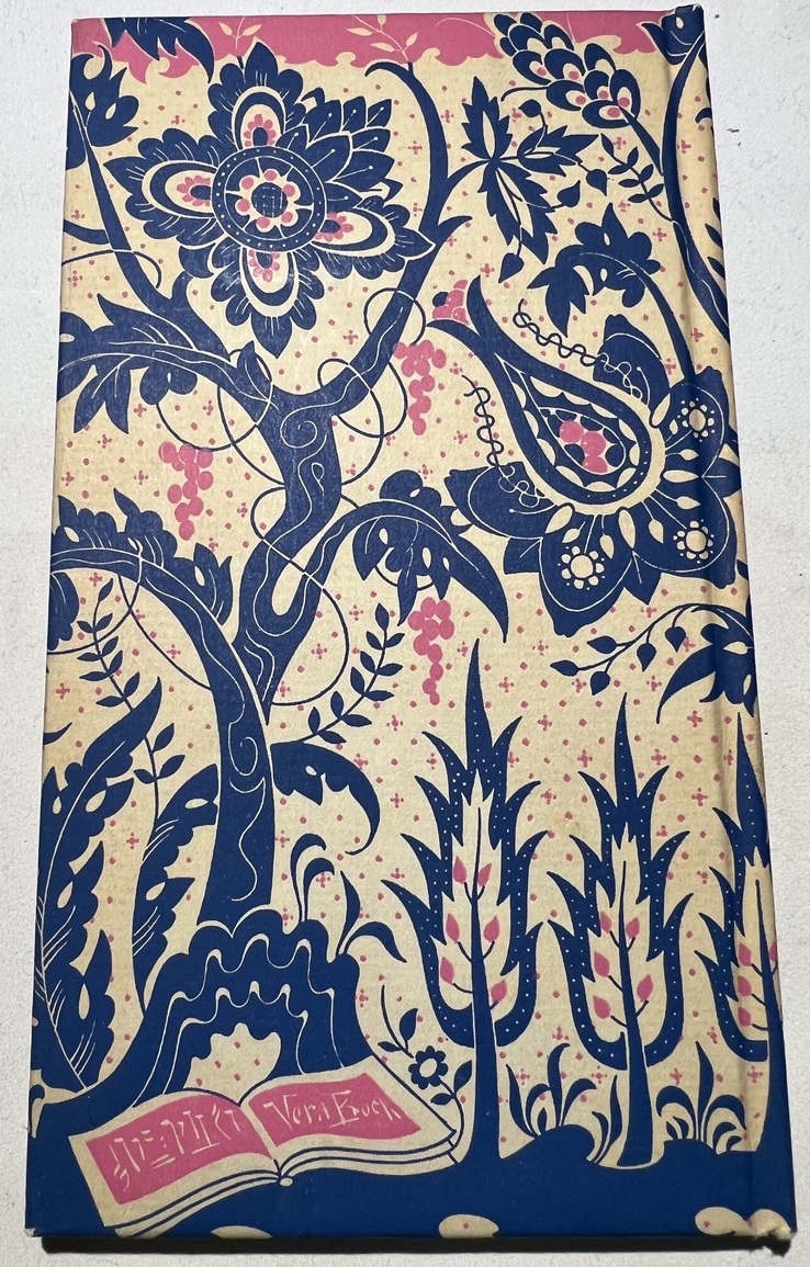
A small, ornate copy by the Peter Pauper Press. It has a beautiful cover with an elegant interior. The artwork was done by Vera Bock. I’ve marked it as approx. 1950s as there’s an inscription that looks to be dated 1957 (I have trouble with cursive) and the McPharlin Peter Pauper Press edition was ball-parked the same.
Update 02/2023:
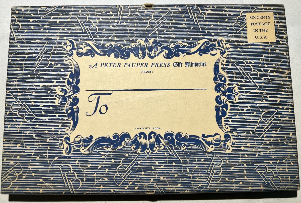
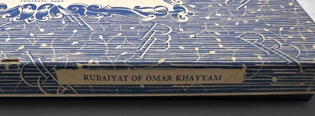
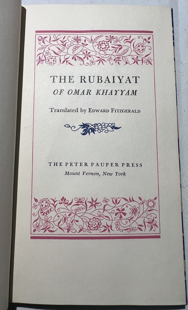
I purchased another copy of this edition that is in better condition (pages are far less yellow) and that came with a unique mailer box. As far as I can tell the copies are of the same edition, anyway, if that understanding changes, the pages will be split out.
Regardless, I’ve taken some pictures of the new copy and added it to this page to show the quality difference and the unique mailer box. So pictured are two copies of this same edition that I own. I have noted which ones are from the ‘new’ copy (except the ones that are clearly with the mailer box) with the label ‘(Mailer box copy)’. The ones not labeled are the ‘original’ copy. They are easy to tell apart due to the yellow tint of the ‘original’ copy.
I’ve also replaced the edition ‘thumbnail’ with that of the new copy, since the colors are much more vibrant.
One copy of this edition was donated by Bill Cloutier and the other contributed by Kurt Hopkins. Thank you both!
The Book Itself
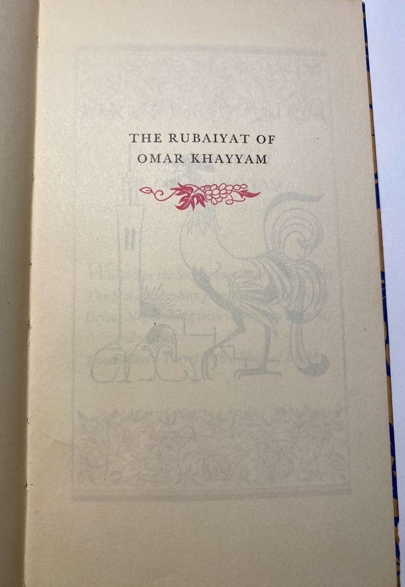
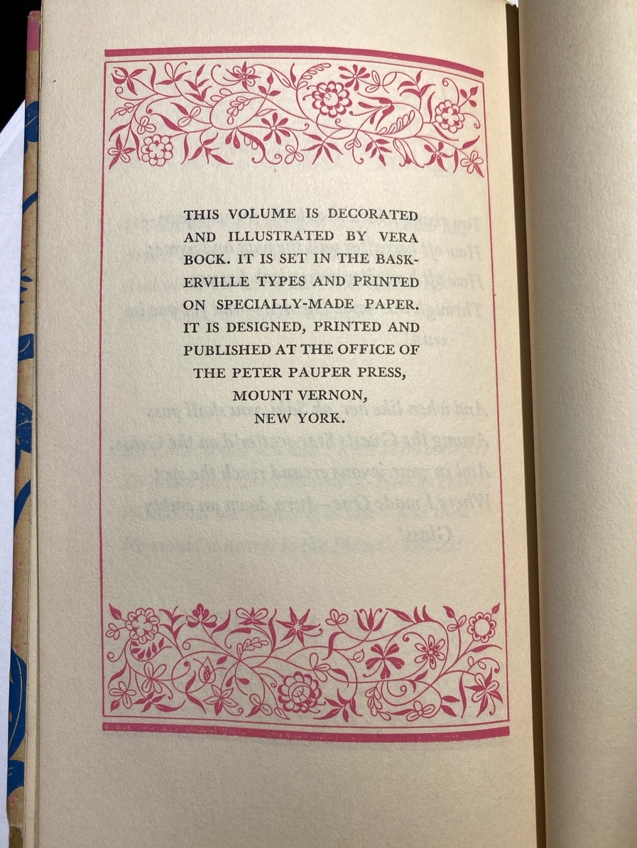
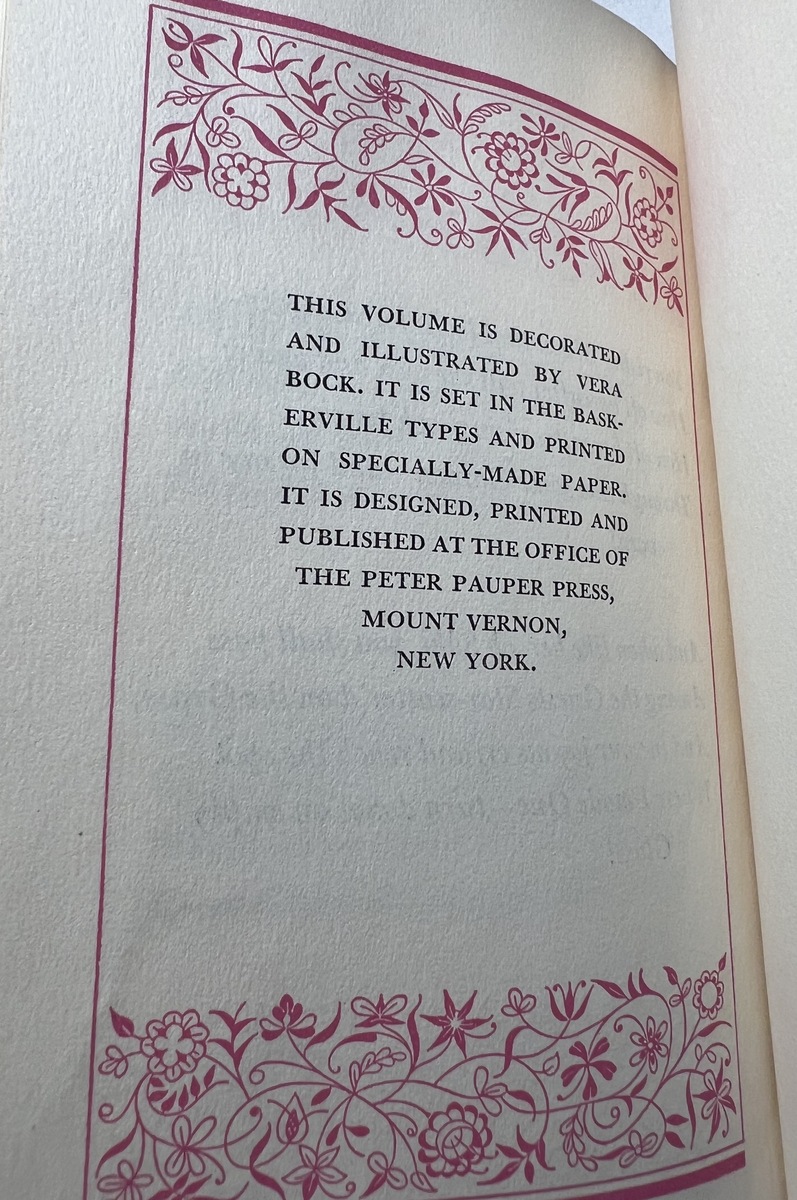
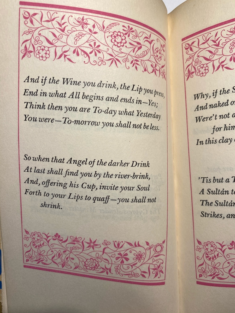
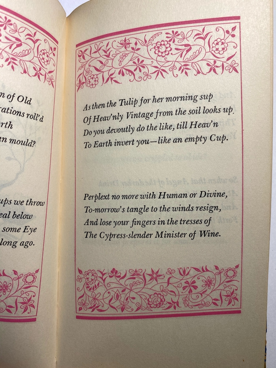
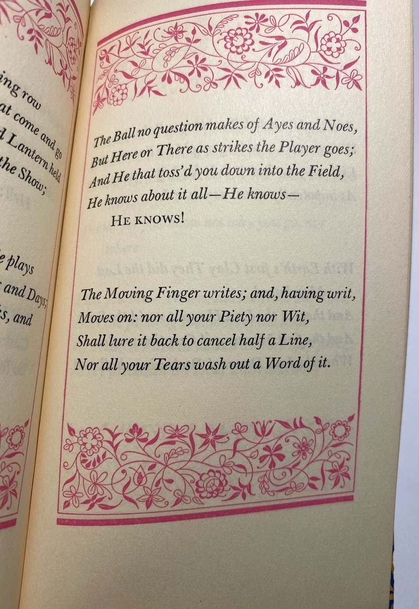
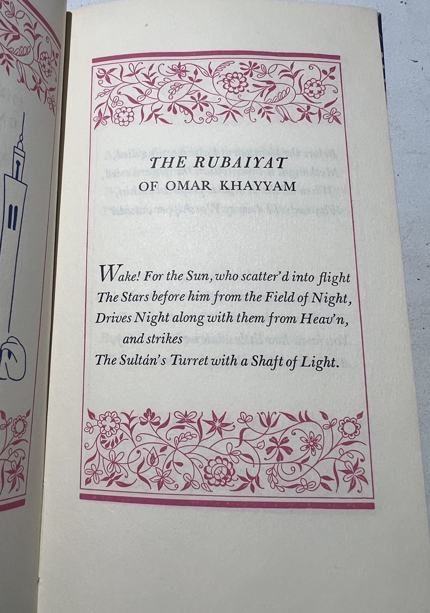
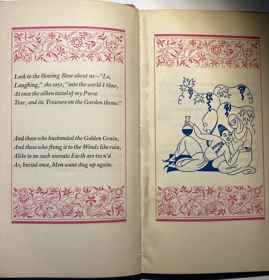
The cover artwork wraps around the entire book. The interior has beautiful containing decorations that add color and intrigue to each page. It is tiny but robust.
The mailer box that came with one of my copies is in great condition and has a gold tone ‘frame’ inside of it that holds the book in place. It’s really beautiful and kind of amazing that it exists.
The Poetry
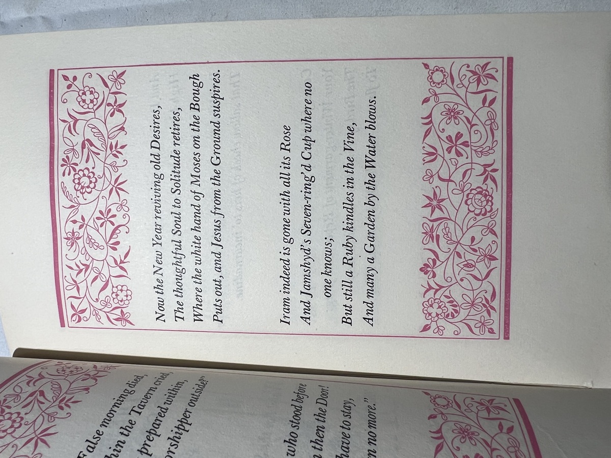
Baskerville font! It looks great. I wish they had like ‘X Quatrain’ markers, but it works. Looks good and reads well.
The Illustrations
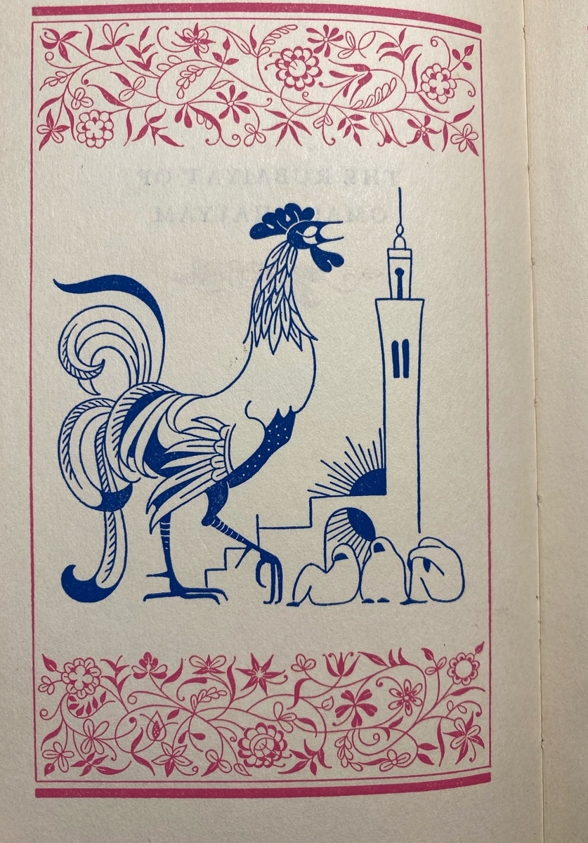
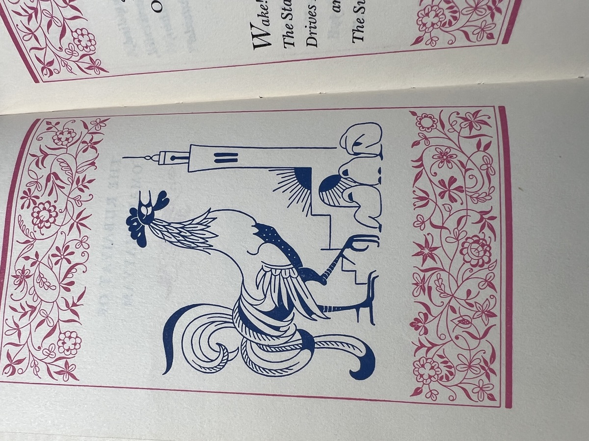
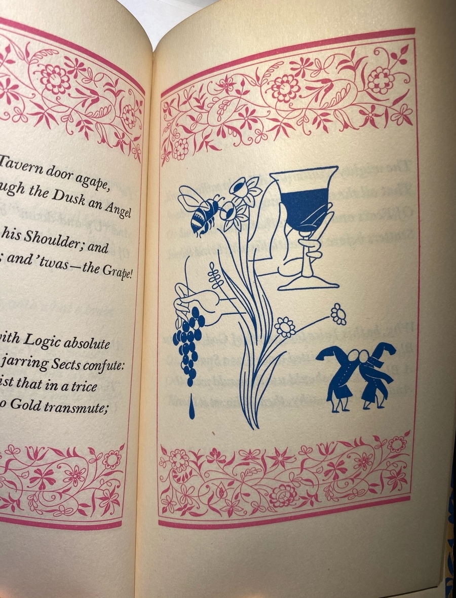
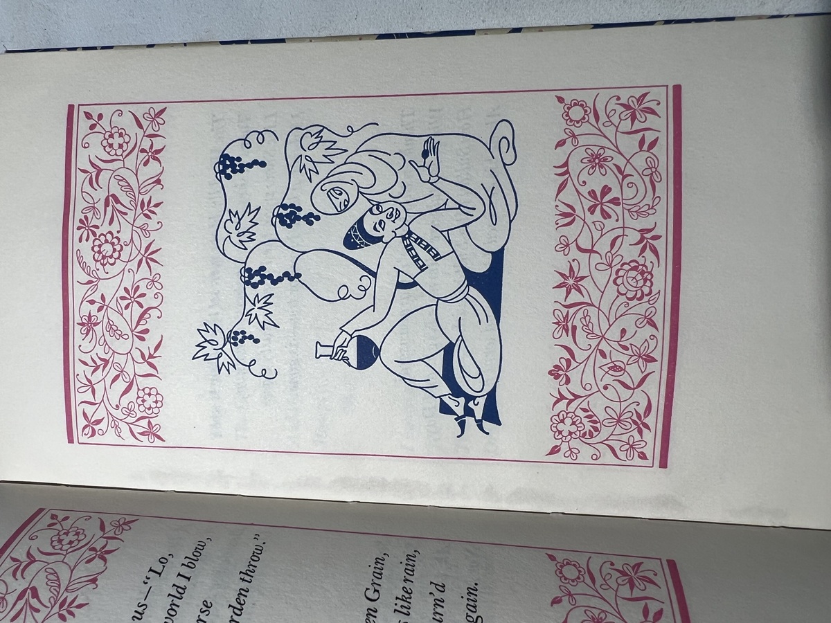
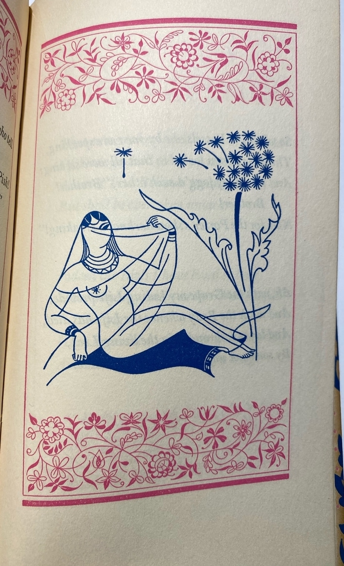
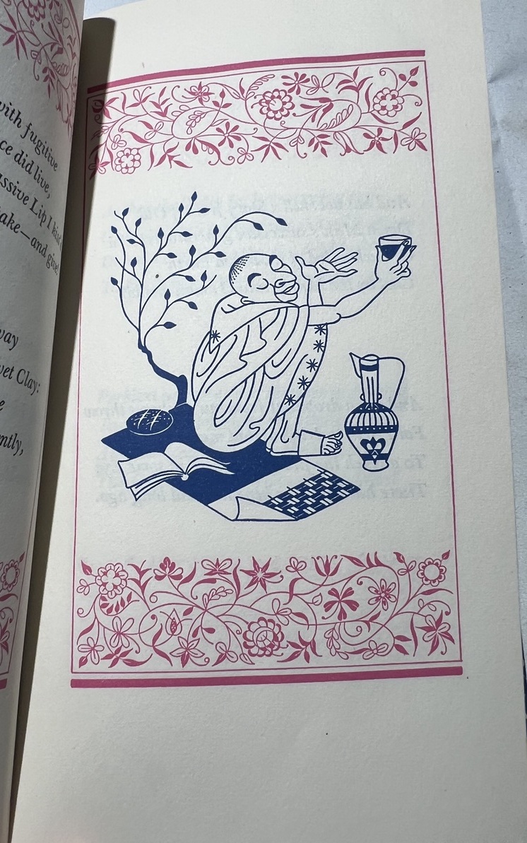
Striking sketches from Vera Bock. Some of them are quite abstract and odd. I appreciate the strange minimalism of them, but not necessarily in love with them.
