The Rubaiyat of Omar Khayyam:
~1930 Crowell Pogany Peachy/Yellow Cover with Georg Saintsbury Intro
Another 1930s approx. Thomas Y. Crowell & Company with Willy Pogany’s illustrations Rubaiyat edition. The 1930 year is determined by an inscription rather than an actual printed date. It’s not the first ~1930s approximate Crowell & Pogany Rubaiyat edition on the site (this edition being the other). It’s not the first, but it’s definitely the most confounding of them and probably on the site so far. There is a great deal surrounding this edition that made me lose my mind a bit. See the book section and sourcing section for the confusing details.
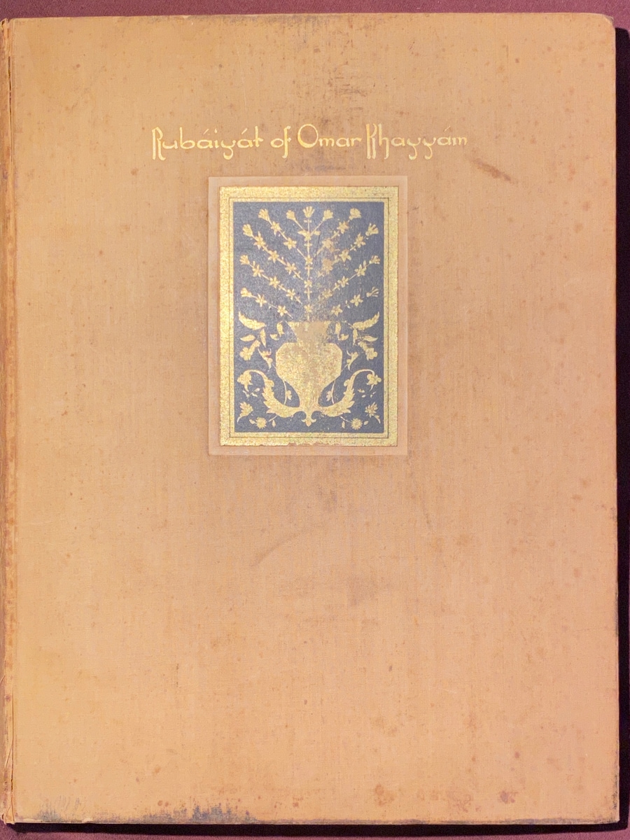
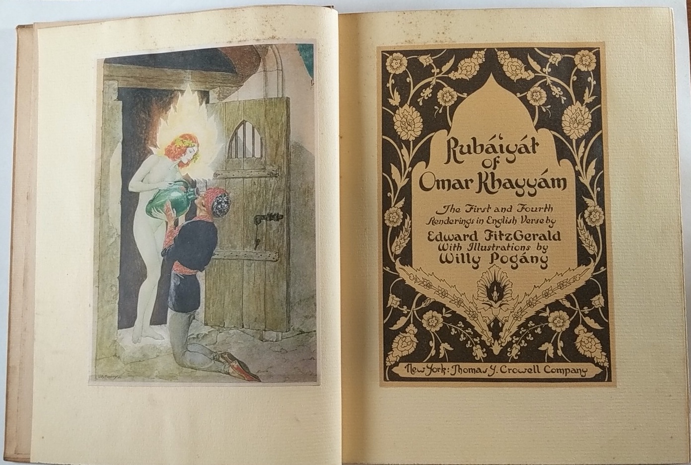
Regardless of any of that, this Willy Pogany Rubaiyat edition evokes a sophisticated and classical feel for me due to its color scheme, the decorations on the poetry page and cover, and the colors of the illustrations. I am not sure if that was the intent, but it’s an interesting style nonetheless for a Rubaiyat and it stands out against other editions.
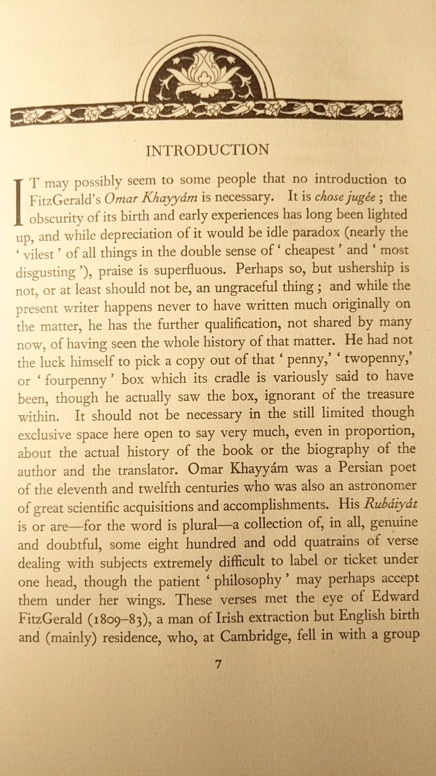
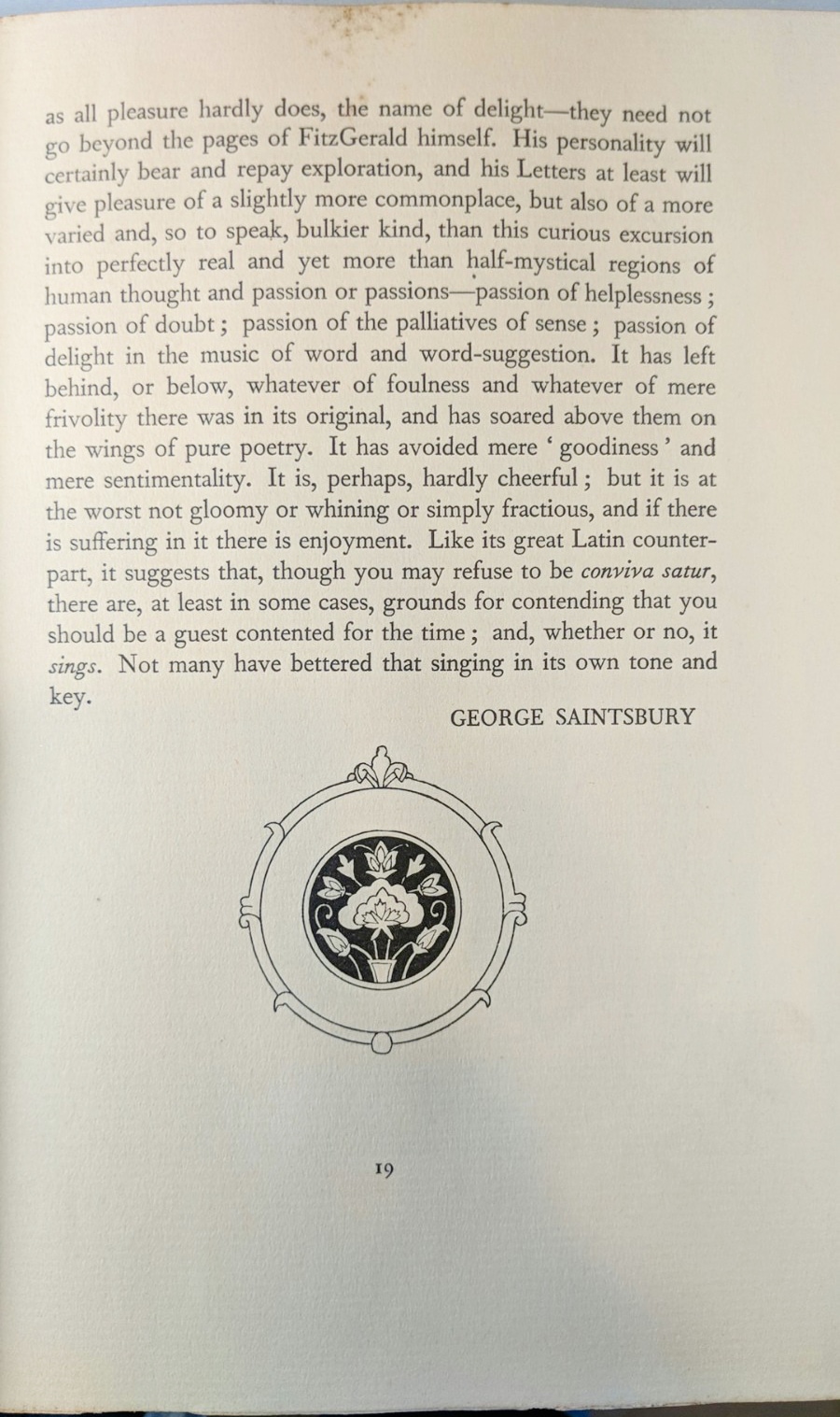
To distinguish this edition from the other ‘similar’ (in terms of metadata) edition, I’m calling this the Peachy/Yellow Saintsbury edition as the cover is either peachy or yellow depending on the lighting and due to the intro being written by George Saintsbury.
This Rubaiyat was contributed/shared by a visitor who also sold it to me. Many of the photos were taken by the contributor, but some of them were taken by me after I purchased it. I’ve marked as such.
The Book Itself
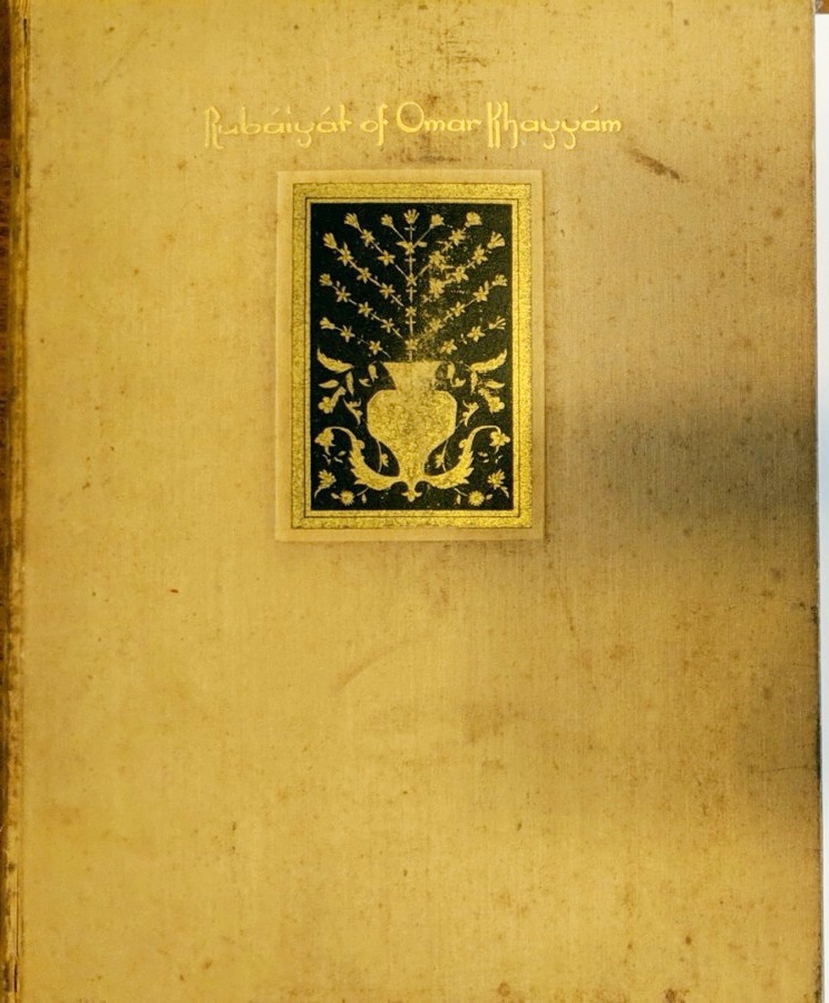
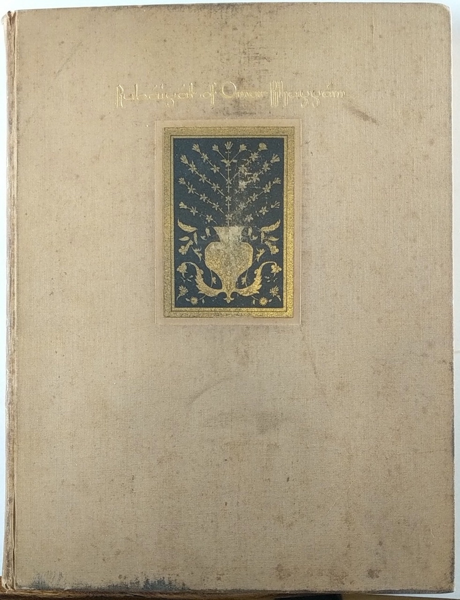
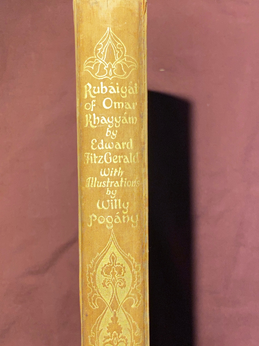
The book’s binding is of this soft, sort of cloth-like material that has a hue that is hard to describe. It’s either this yellow-ish/orange-ish/salmon-y/peach-y color that, under the ‘right’ or ‘wrong’ lighting conditions, can also look ivory. The contributor’s initial photo had it looking more ivory, then, after research finding similar copies with different color tones, I asked if it was like a yellow hue faded out. Then he took a photo with a white card and it looked yellow! In person, though, I can see it being considered ‘peachy’ and I took a photo with my lighting and it turned out more peachy for sure. It’s confusing and jarring that the same book can look so different depending on lighting.
This confusion over what color it is exactly further reared its ugly head when I was doing price/info research on the copy. Sellers called it all sorts of colors and the photos were all over the place. It was unclear whether they were actually different color versions or if this is the case where the lighting/balance is all off so they look different (as clearly, it can).
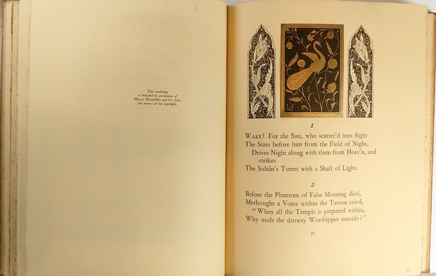
Beyond that of note, pg. 90 states that one of the renderings was included with “permission of Messers Macmillian and Co. Ltd, the owners of the copyright.” Interesting! And the introduction by George Saintsbury, of course.
The Poetry
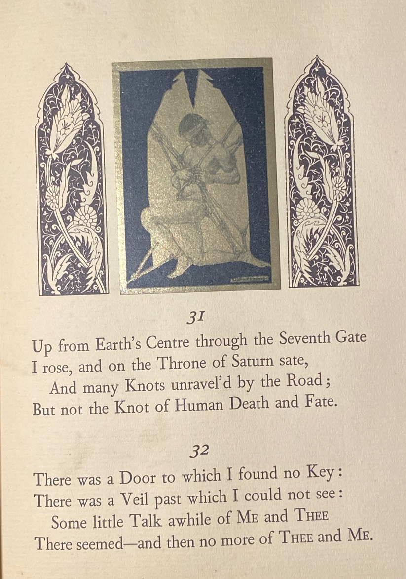
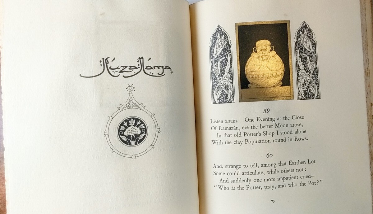
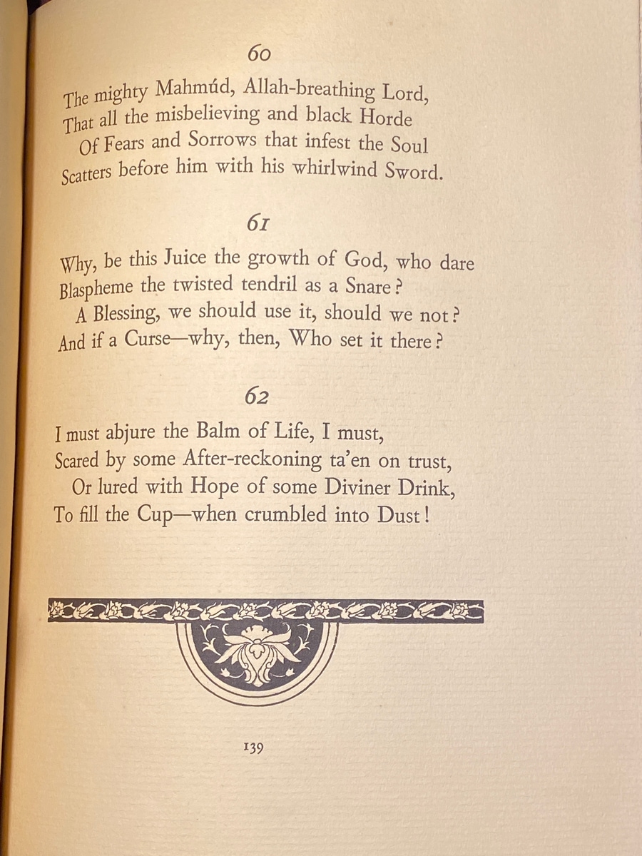
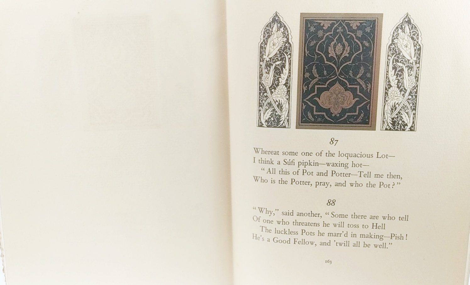
Some of the poetry pages have decorations above the quatrains. Some of those pages have this golden ‘sticker’ for lack of a better term and printed designs accompanying it, and others just printed art. A few of the golden stickers had Willy Pogany’s signature on the edges.
The Illustrations
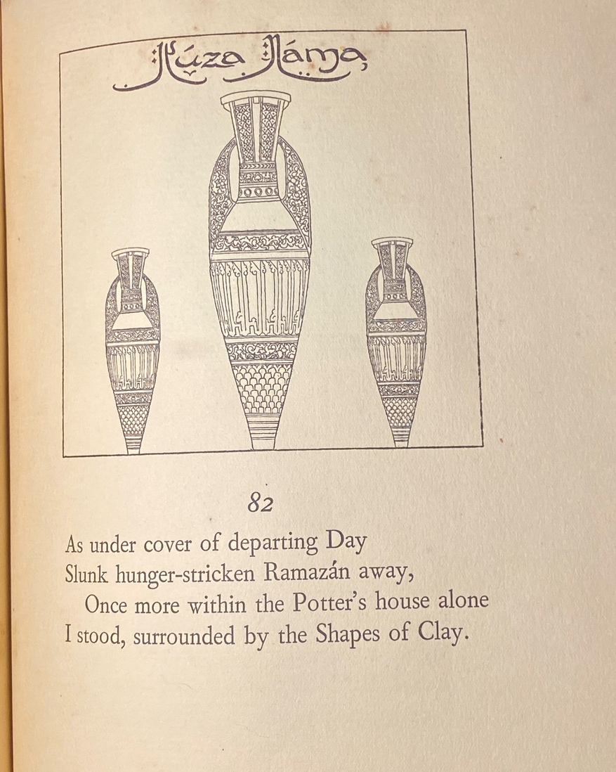
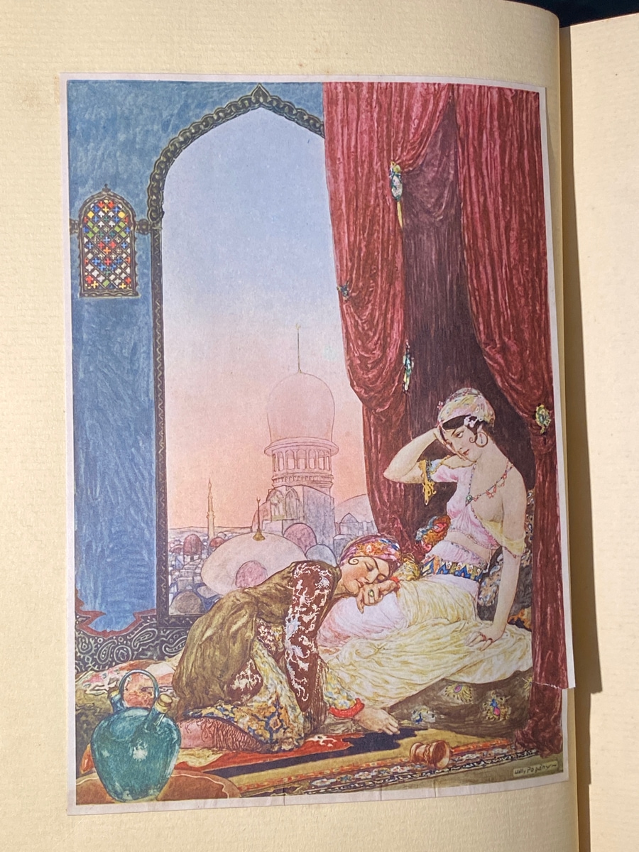
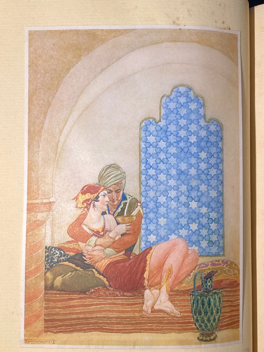
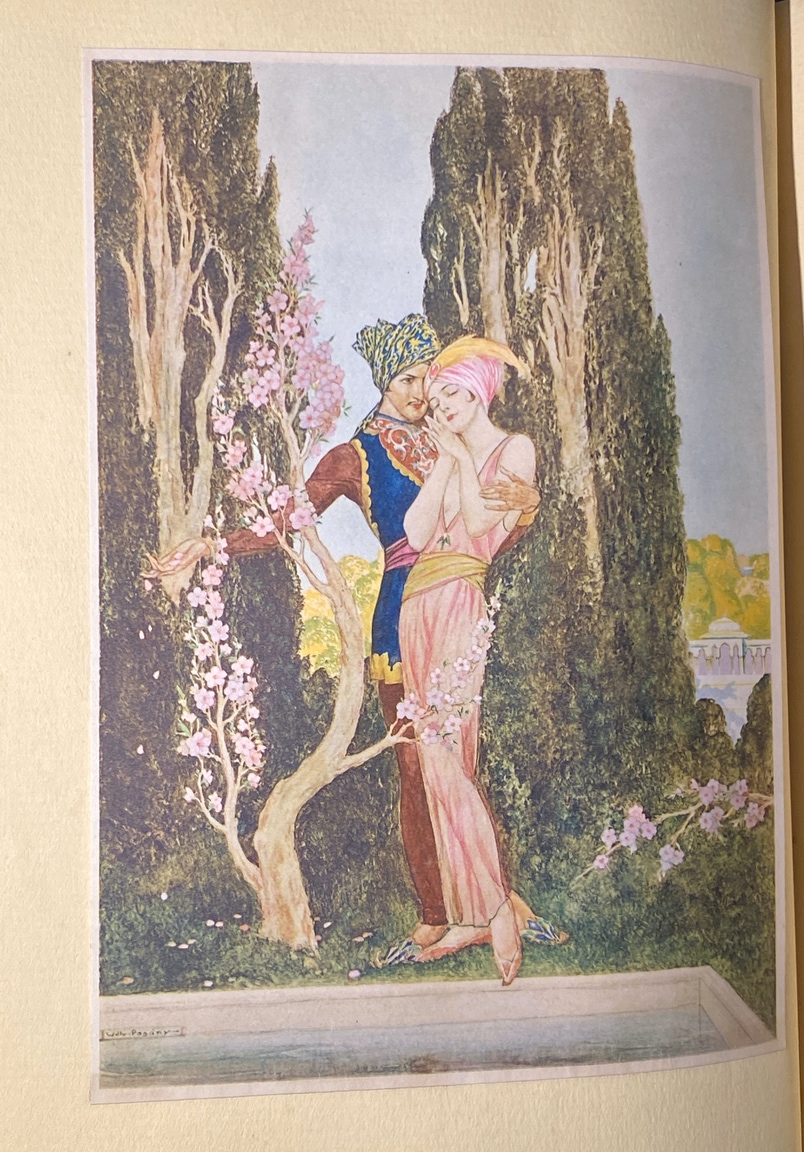
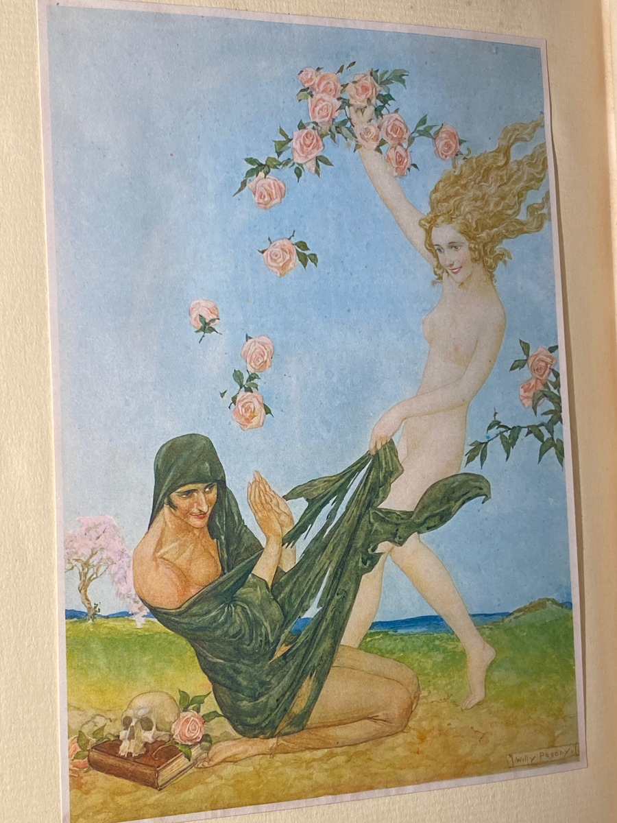
This Pogany artwork is different than the other Pogany artwork I’ve seen thus far. The artwork contained in this edition feels more forward and bright, due to the color choices and the style. It’s surprising and not what I expected from Pogany artwork, but it’s striking in its own way.
History/Information Sourcing
Okay. This edition is really a weird one. I actually have so many unanswered questions with this one.
First, when trying to find more about this copy, stumbled upon this prospectus (basically looks to be a proof of some illustrations and the binding itself). The seller said it was from 1909…and yet the book seems to have been actually printed in ~1930. Why the delay? What caused the gap? I don’t know. Theories: someone was a blocker in the development chain, WWI caused problems somehow, they didn’t want to go to print yet, and…I don’t even know!
This edition looks essentially the same as the copy I have, however…the publisher is the George G. Harrap Company in London! The publisher is different, but it’s essentially the same book! Was this edition…white labeled for different regions/publishers? Does that explain the prospectus? They were trying to sell it to multiple publishers? Again, I don’t know.
I am also not even sure if there are different color bindings of this edition (see a ‘salmon’ one here), or if it’s all a lighting issue/faded copies. One of the listings I found on eBay also included a box, which I’ve yet to find another with. Is this the same run? Did all the others have boxes that have been lost to time?
So, from all this, my main theory is that this ‘style’ of book was like shopped around for publishers to take and make. Hence why multiple publishers from different areas printed this ‘style’. It was a template for publishers to white label….and maybe there were slight variations as a result. I don’t have a better theory right now besides development hell. As always, feel free to reach out if you know more or have ideas!
